A washed look without losing the message: the waffle-knit long sleeve
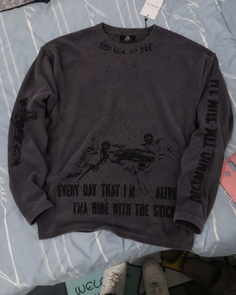
The vintage finish was meant to soften the appearance of this charcoal waffle-knit long sleeve and give it a relaxed, worn-in look. The challenge was getting the dark lettering to read clearly across the washed color and raised texture of the waffle knit.
Three variables, one finished surface
Waffle texture, a washed color and dark graphics all affected how clearly the words could be read. The letter shapes from the flat artwork appeared across the fabric’s raised and recessed surface, with the grid of the knit visible through the ink. Assessing the development meant reviewing the fabric, finish and print together on that completed surface, including the definition of the lettering against the washed charcoal ground.
Give the intended look a technical starting point
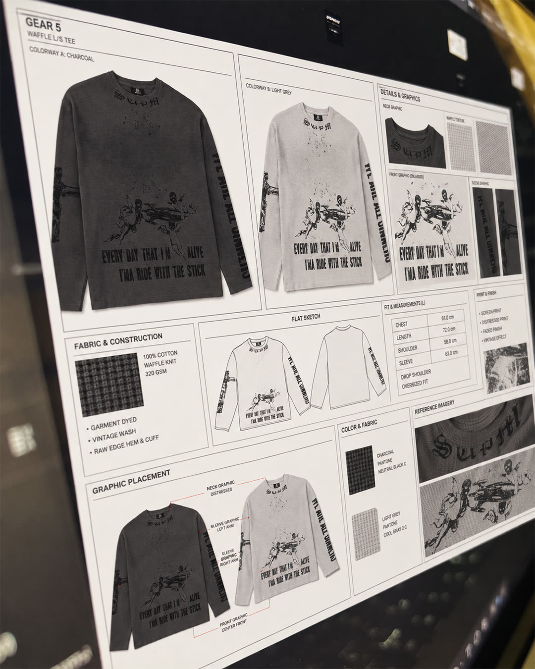
The supplied technical sheet set development targets of 100% cotton waffle knit at 320 gsm, with garment dyeing, a vintage wash and raw edges at the hem and cuffs. Verification of the stated composition and weight would require laboratory results.
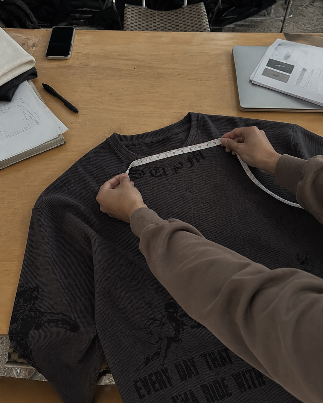
The sheet also showed an oversized silhouette with dropped shoulders. Its size L measurement targets were chest 61 cm, length 72 cm, shoulder 58 cm and sleeve 63 cm. These drawings and dimensions gave the visual reference a defined garment shape to work from during development.
Design communication

Design development
Treat each print zone as part of the layout
The workshop clip showed light-colored waffle panels, print-positioning work and screen printing. An operator aligned the screen over a garment outline before pulling ink through it with a squeegee. Printed panels later appeared beneath a heated drying unit.
The artwork extended across the neckline, lower body and sleeves. Curved lettering sat below the neck rib, and two lines of wording accompanied the larger illustration near the hem. The wording in those front areas was intended to remain legible across the waffle texture. Gaps and broken strokes gave the larger graphics their distressed appearance. The area covered by ink, its darkness and the spacing between print zones affected how prominently each part appeared within the layout.
Review the print on the finished garment
In the finished-garment video, the charcoal surface and waffle texture were visible alongside the dark lettering and graphics. The full layout provided a reference for the next review of the print positions and the prominence of each area on the washed shirt. Fashionme’s role is to connect the technical brief, print execution and garment-level review so the vintage direction can be assessed without losing sight of the design’s message.
Your reference could be next
Have a washed or textured design? Share the fabric direction, artwork and finish reference so we can identify what needs to be checked together.
Discuss your product with Fashionme or explore more case studies.
Project scope: product development and finished-garment review. Photos and clips document selected stages; they do not establish bulk-delivery results or certified performance tests.