Custom Layered Screen Print Zip Jacket
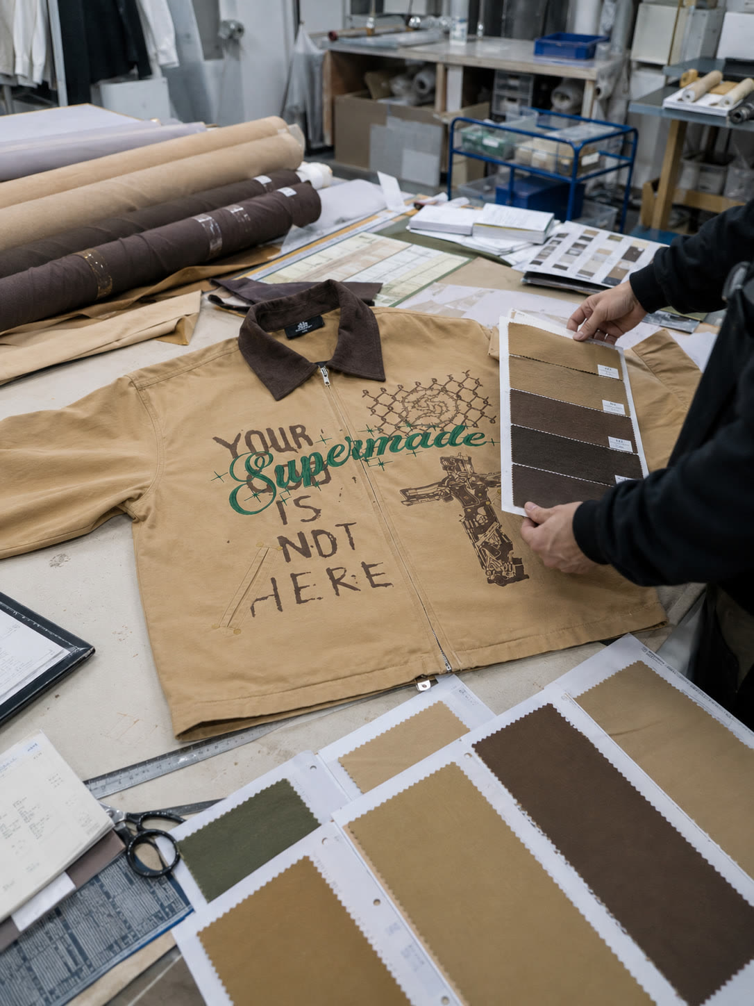
The intended artwork for this sand-colored zip jacket combined deliberately worn brown graphics with readable green script. The dark textured collar added to the contrast across the garment. The center-front zipper ran through the printed area, so the print layout had to allow for how the two front panels would meet during sewing.
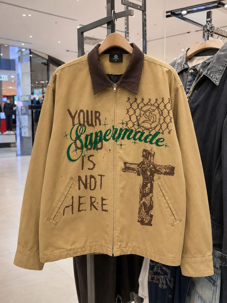
Different graphic elements need different treatment
The more defined green script crossed brown lettering and a chain-link motif at chest height, running over graphics with irregular outlines and worn-looking gaps. Preserving the design’s character required deciding where the distressed treatment belonged within a connected front layout that kept the green lettering readable through the overlapping artwork.
Choose the palette as a group
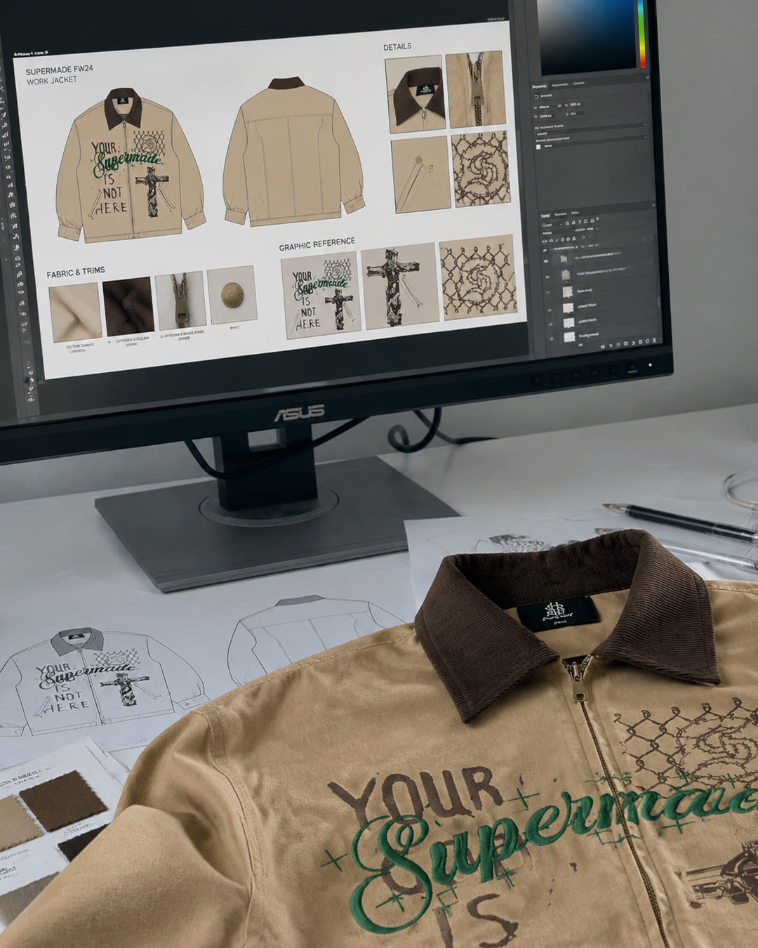
Fashionme coordinated the material and print choices for the sand body, dark brown collar and brown-and-green artwork. The collar and print shades had to suit that complete combination, with each color judged beside the others on the garment. The supplied development imagery showed fabric and color references alongside the jacket, including a card of sand and brown shades held next to the printed front.
Design communication
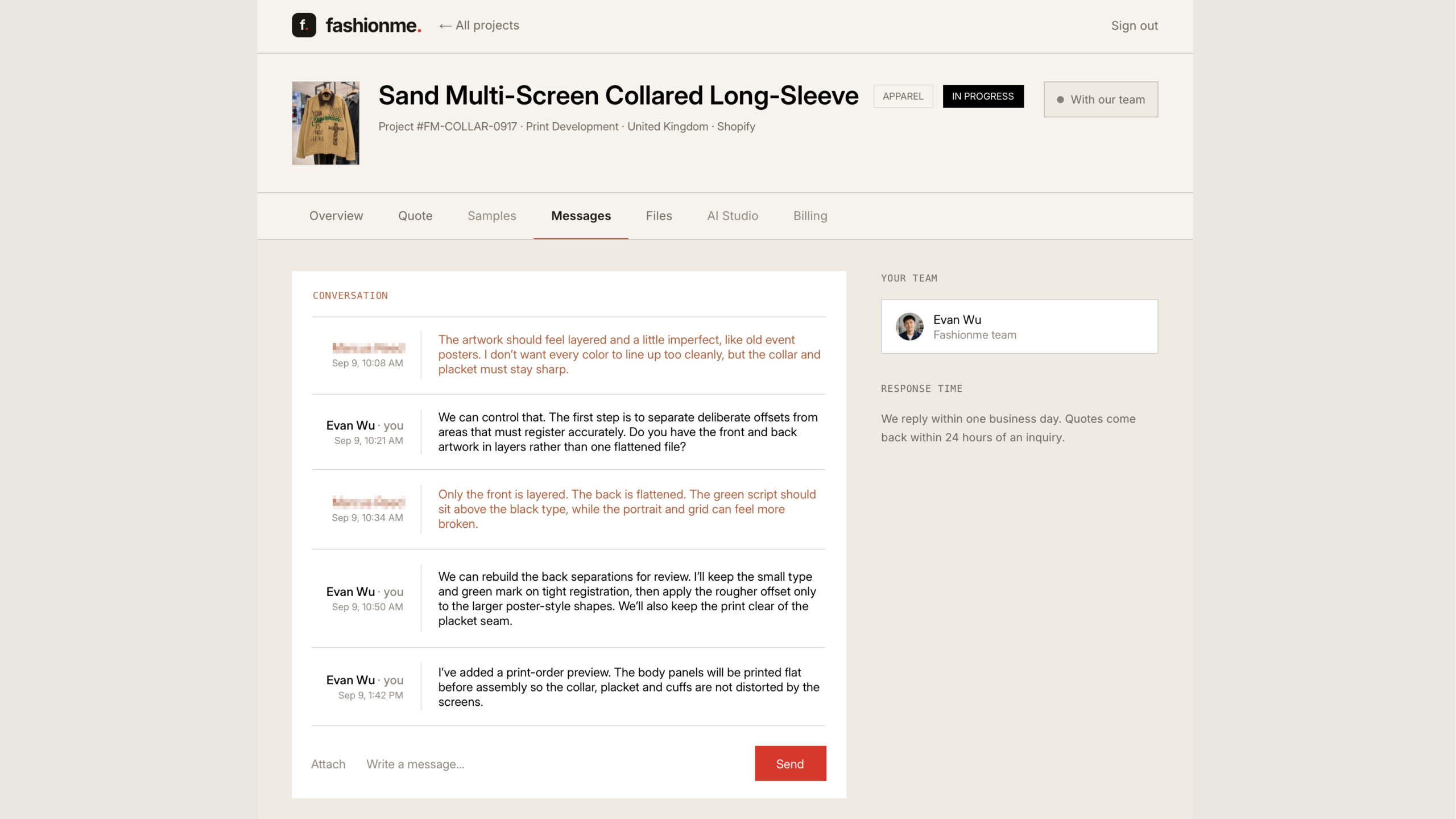
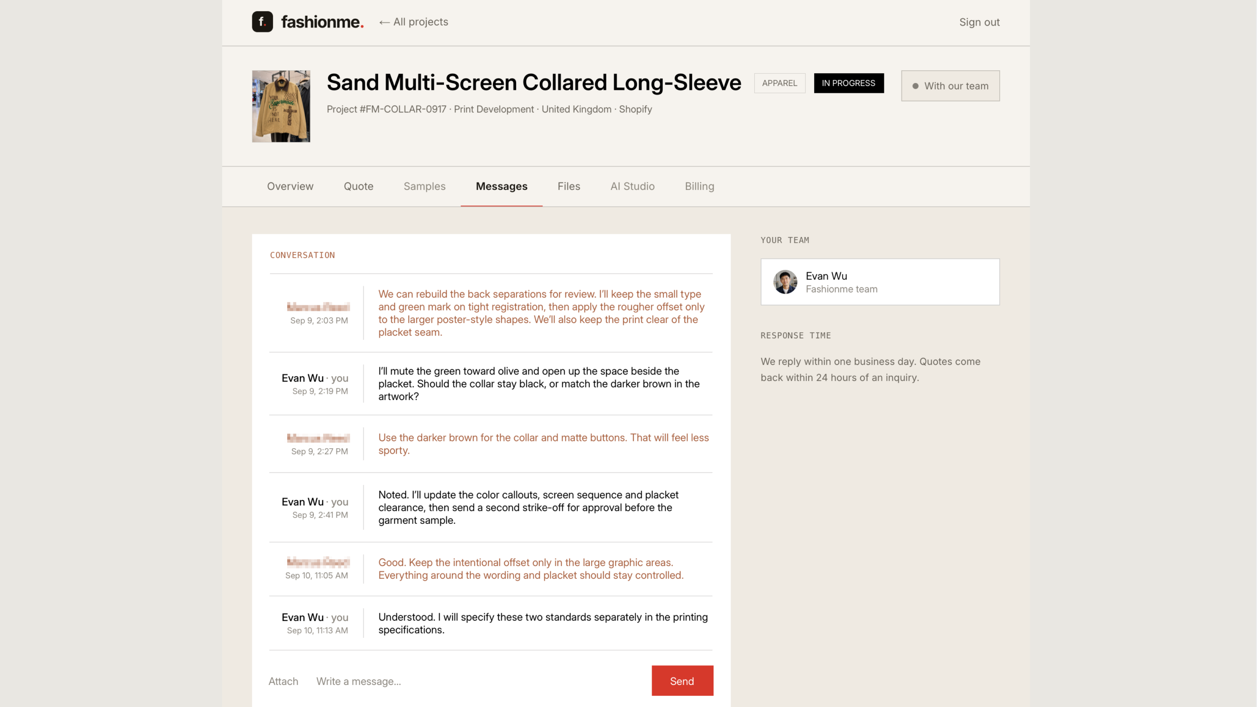
Design development
Plan the print around the garment structure
The workshop footage showed screens being prepared and graphics being printed onto flat panels. The finished front included a center zipper and slanted pockets, with the green lettering extending across the zipper and lower graphics beside the pocket openings. A layout for the separate prints had to account for the space occupied by those features and bring the artwork into a complete front composition after the panels were sewn together.
Bring the layers back together
The finished-garment video showed the sand body, dark collar, green script and brown graphic layers on the assembled jacket, along with the artwork on the back.
The brand could review how the front artwork crossed the zipper and sat around the pockets, with the fabric and print treatment visible on the sewn garment. The collar and artwork colors appeared against the sand body in that view, along with the printed edges and the construction details that shaped the layout.
Your reference could be next
Share your layered artwork and garment reference. We’ll help identify how the print, fabric and construction need to work together.
Discuss your product with Fashionme or explore more case studies.
Project scope: product development and finished-garment review. Photos and clips document selected stages; they do not establish bulk-delivery results or certified performance tests.